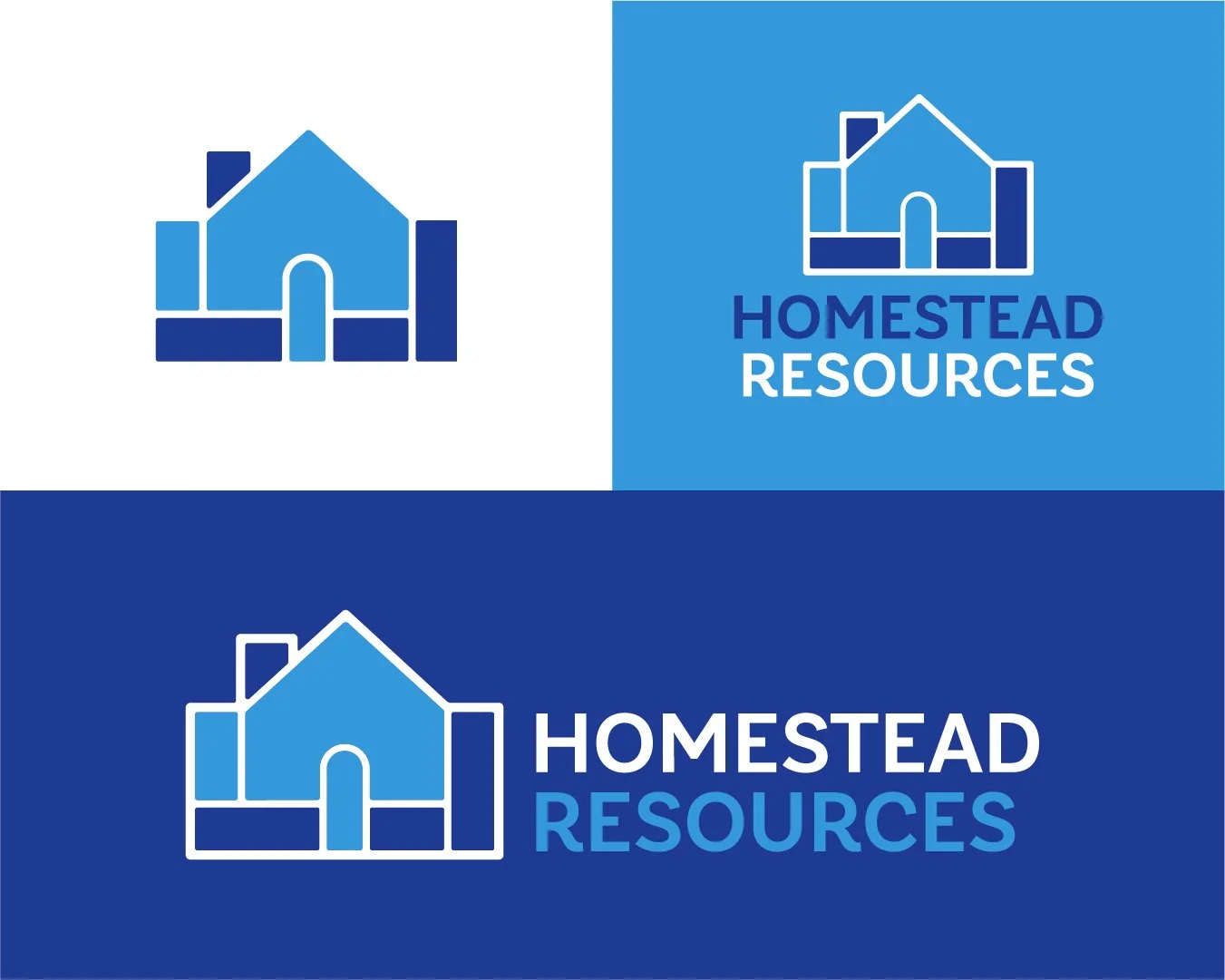
Homestead Resources Rebrand
Team:
Creative Director: Sabreena Sorrel
Account Manager: Mary Ellen Romero
Graphic Designer: Jalen Moore
For Mojo Up Marketing + Media
Project Timeline:
Jan - March 2024
Background
Homestead Resources (previously HomesteadCS) is a nonprofit organization that works with individuals and families providing education, resources, and financial help ensuring they have the opportunity to live in a safe, affordable home in a well-maintained neighborhood.
HomesteadCS came to Mojo Up Marketing + Media seeking to develop a comprehensive plan to rebrand the organization. A rebrand would provide a fresh start, help in reaching new audiences, and better tell their story. The new name, brand, and visual identity needed to be easily recognizable and give people an idea of what the non-profit offers. My primary role in this project was to create the new logo, color palette, and icon suite. You can read the full case study here.
The Challenge
Brand Confusion: The organization’s existing name and identity did not clearly communicate its mission or services. Confusion arose due to associations with unrelated businesses, like a local bakery for example.
Low Awareness: Limited community recognition made it difficult for clients, donors, and stakeholders to understand and engage with their offerings.
Misaligned Identity: The outdated website and visuals did not represent the organization’s capabilities, hurting donor confidence and client accessibility.
Funding Perception Issues: The inclusion of "consulting" in the name led to misconceptions about the organization's non-profit status.
Goals & Objectives
Establish a Recognizable Brand in the human service field and donor community.
Educate audiences about the variety of its solutions, including financial literacy, foreclosure prevention, and housing counseling.
Engage new clients, donors, and funding sources by enhancing brand storytelling and identity.
Create a welcoming and professional brand that aligns with its mission to help individuals retain their homes and achieve financial independence.
early concept sketches
early brandmark concepts
Similar to any logo ideation process, we worked with the client to define what would make this logo successful. The logo had to:
feel warm and inviting (approachable, compassionate, visually appealing)
be visually clear and concise (lean, accessible)
be a balance between how banks and human services present themselves (professional, mission-oriented, trustworthy)
not be open to interpretation (recognizable)
Some other brand touchpoints we designed for the client were; Brand Guidelines to help ensure their brand was used properly internally and externally for the foreseeable future and a suite of custom icons representing different services they offer. Overall I was proud to work on this project and glad to know we helped an amazing organization like Homestead Resources.
custom icons for Homestead Resources
Results
Improved Brand Clarity: The rebranding clarified Homestead Resources' mission and differentiated it from unrelated entities.
Enhanced Accessibility: Behind a clearer Brand Identity Homestead Resources has been able to better communicate their range of services available to clients and donors.
Stronger Community Engagement: Through targeted storytelling and updated visuals, Homestead Resources has begun attracting more attention from local partners, funders, and potential clients.


